
Crafting stories that capture people’s attention and that can effectively convey a message is one of the most powerful skills you can have. Yuval Noah Harari argues it’s our species’ superpower.
One tool that is getting ever-increasingly better for storytelling is data visualization. And I hope AI blows it out of the water, to make it accessible for those of us who are just not good at crafting those.
In the meanwhile, I watch in awe while others craft pieces of art with data.
Hans Rosling
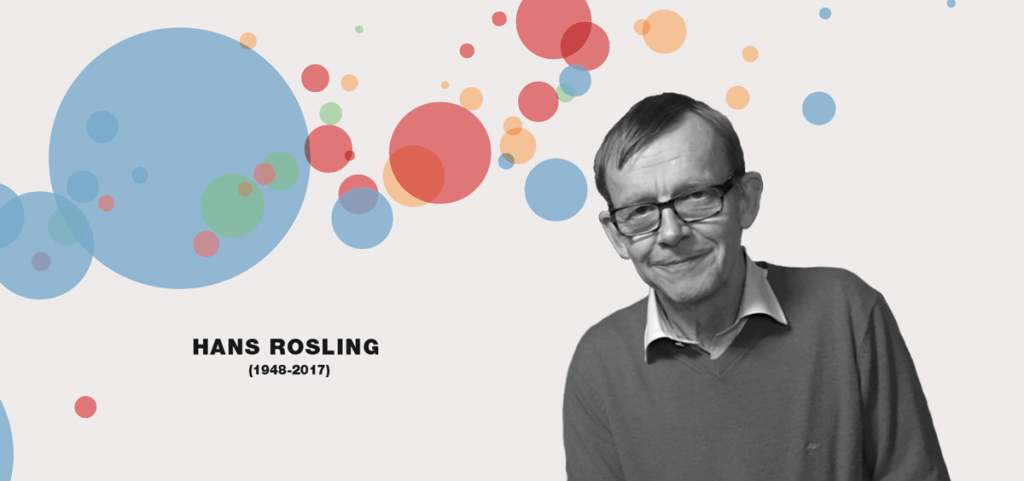
When video online became something usable back home, I was able to reach TED talks. It was then that I came across the fantastic work of this Swedish doctor, and I was mind-blown on how data presentation with animations was done.
There’s a playlist of his best TED talks. And I’m always fascinated to rewatch some of those.
Our World in Data
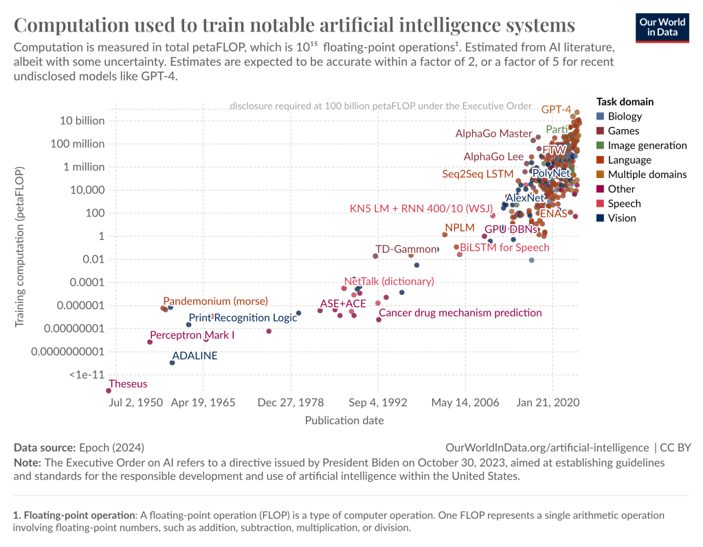
This site by Oxford University is a fantastic place to check out. While you can put together your own visualizations and retrieve data from many sources, they have a set of reports that efficiently and precisely convey information in beautiful ways.
Napoleon’s Russian Campaing Map
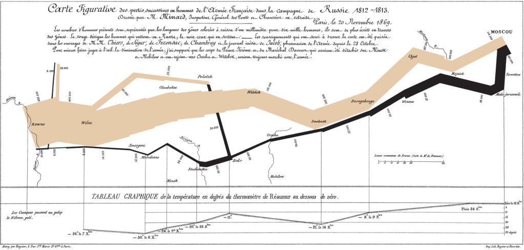
In 1812 Napoleon headed into Russia with a huge army, with disastrous results and a horrifying death count. Charles Minard depicted what happened and the time via an amazing chart that summarizes a lot of information with very little text.
Financial Data

Since Financial analysts have been processing massive amounts of data looking for signals and events since forever, they have developed excellent tools for that. Most of those are paid, but you can get a sample taste of that over at Finviz.
Have a good one.
